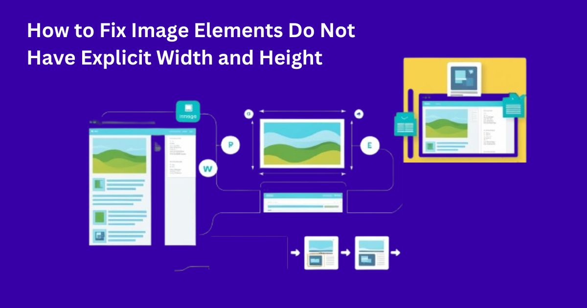
How to Fix Image Elements Do Not Have Explicit Width and Height
When images on your website lack defined dimensions, they can cause layout shifts that frustrate visitors and hurt your SEO performance. This comprehensive guide will walk you through why explicit width and height attributes matter and how to implement them correctly.
What Does “No Explicit Width and Height” Mean?
Have you ever been on a website where everything suddenly moves around as it loads? That jarring experience is often caused by images without predefined dimensions.
When building websites, image tags in HTML can include attributes for width and height. Think of these as reserving a specific amount of space on the page – like putting down placeholders before the actual images arrive. Without these dimensions, browsers initially allocate zero space for images. Then, as each image loads, the browser has to reshuffle everything, causing those annoying shifts we’ve all experienced.
This layout shifting has a fancy name – Cumulative Layout Shift (CLS) – and it’s actually important enough that Google considers it when ranking websites. Poor CLS scores can hurt your SEO ranking, potentially burying your site deeper in search results where fewer people will find it.
The Layout Shift Problem
Layout shifts are not just a minor inconvenience. They can affect:
- User Experience: A stable layout helps users interact with content without accidental clicks.
- SEO Rankings: Google’s Core Web Vitals, especially the Cumulative Layout Shift (CLS) metric, factor into your site’s ranking. Reducing unexpected shifts will definitely improving your SEO performance.
Why Adding Explicit Dimensions Is Crucial
Specifying the image dimensions is important for the following reasons:
- Improved Page Load Performance: By reserving space for images, your content loads more smoothly, and browsers can render pages faster.
- Better User Experience: Preventing layout shifts means a more stable and professional appearance.
- Enhanced SEO: Reducing layout shifts can lead to a lower CLS score, which positively impacts your search engine ranking.
Identifying Images Without Dimensions
Before fixing the issue, you need to find problematic images. Here are several methods to identify images missing width and height attributes:
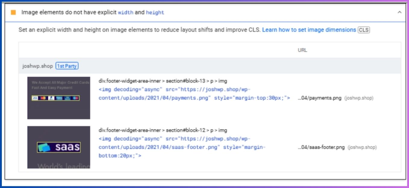
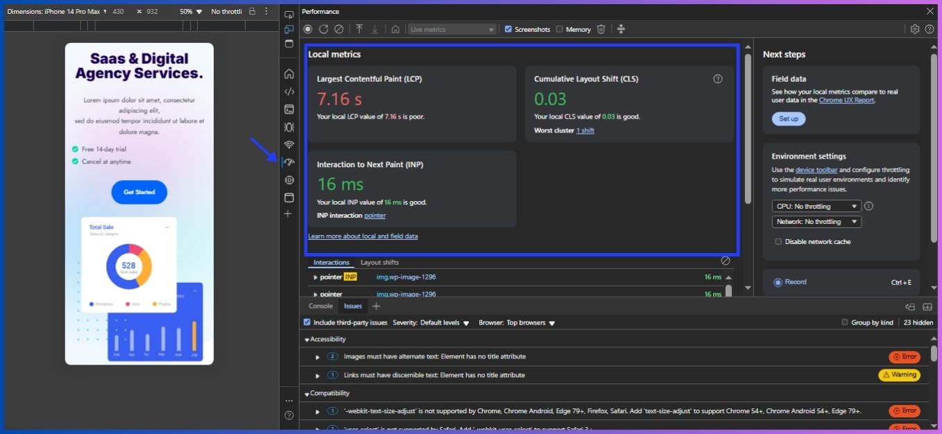
Method 1: Core Web Vitals Report
Check your Google Search Console for layout shift issues in the Core Web Vitals report. This highlights pages with CLS problems that may stem from undefined image dimensions.
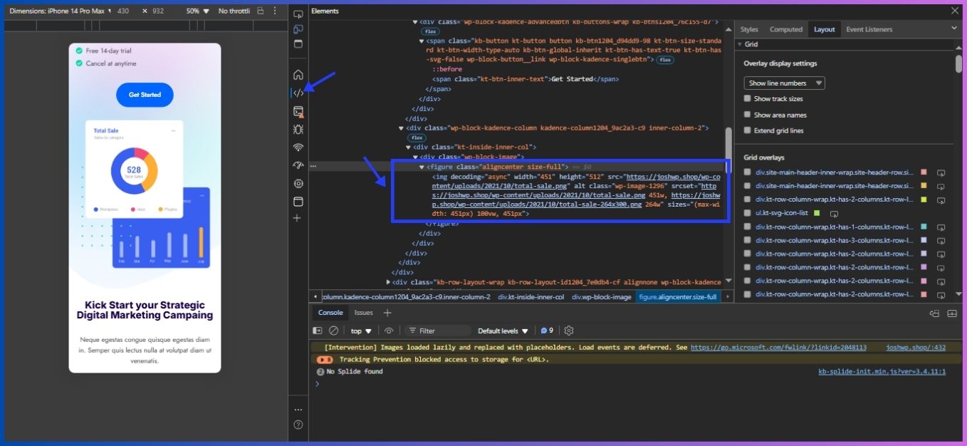
Method 2: Manual Inspection
For smaller websites, examining your HTML source is straightforward:
- Right-click on your page and select “View Page Source”
- Search for <img> tags
- Check if each tag includes both width and height attributes.
You can also click on an image to see its details as shown below.
Method 3: Using Lighthouse
For the technically minded, Google’s Lighthouse tool makes checking for these issues pretty straightforward:
- Just open Chrome DevTools (hit F12 or right-click and select “Inspect”) and navigate to the Lighthouse tab. The report will highlight any images missing dimensions.
- Run an audit with “Performance” selected
- Look for the warning “Image elements do not have explicit width and height”
How to Fix Missing Image Dimensions Using HTML & CSS
1. Set Explicit Width and Height in HTML
The simplest method is to add the width and height attributes directly in your HTML. For example:
<!-- Before -->
<img src="example.jpg" alt="Example image">
<!-- After -->
<img src="example.jpg" width="1200" height="630" alt="Descriptive Alt Text">
By properly sizing your images from the start, you’re essentially telling the browser, “Hey, save this much space here!” This way, the layout stays put as images load in.
3. Use CSS for Responsive Designs
For responsive designs, fixed dimensions might not work perfectly. You can still use CSS to control the layout:
- Container Approach: Set a container with fixed dimensions and allow the image to scale.
- CSS Object-Fit: This property can help maintain aspect ratios when images are resized.
Example using CSS:
<style>
.responsive-image {
width: 100%;
height: auto;
}
.image-container {
width: 600px;
height: 400px;
}
</style>
<div class="image-container">
<img src="example.jpg" class="responsive-image" alt="Descriptive Alt Text">
</div>
Modern CSS gives us some clever tricks for keeping images looking good while still being responsive:
<img src="example.jpg" alt="Example image" width="800" height="600" style="aspect-ratio: 800 / 600; width: 100%; height: auto;">4. Using the <picture> Element with Dimensions
When using responsive images with the <picture> element, make sure to include dimensions:
<picture>
<source media="(max-width: 768px)" srcset="small.jpg">
<source media="(min-width: 769px)" srcset="large.jpg">
<img src="fallback.jpg" alt="Responsive image" width="800" height="600">
</picture>
How to Fix Image Elements Without Explicit Width and Height Using Plugins
If you manage a large website, the thought of manually updating every single image might make you want to pull your hair out, as it is impractical. Consider any one of the following plugins to achieve that:
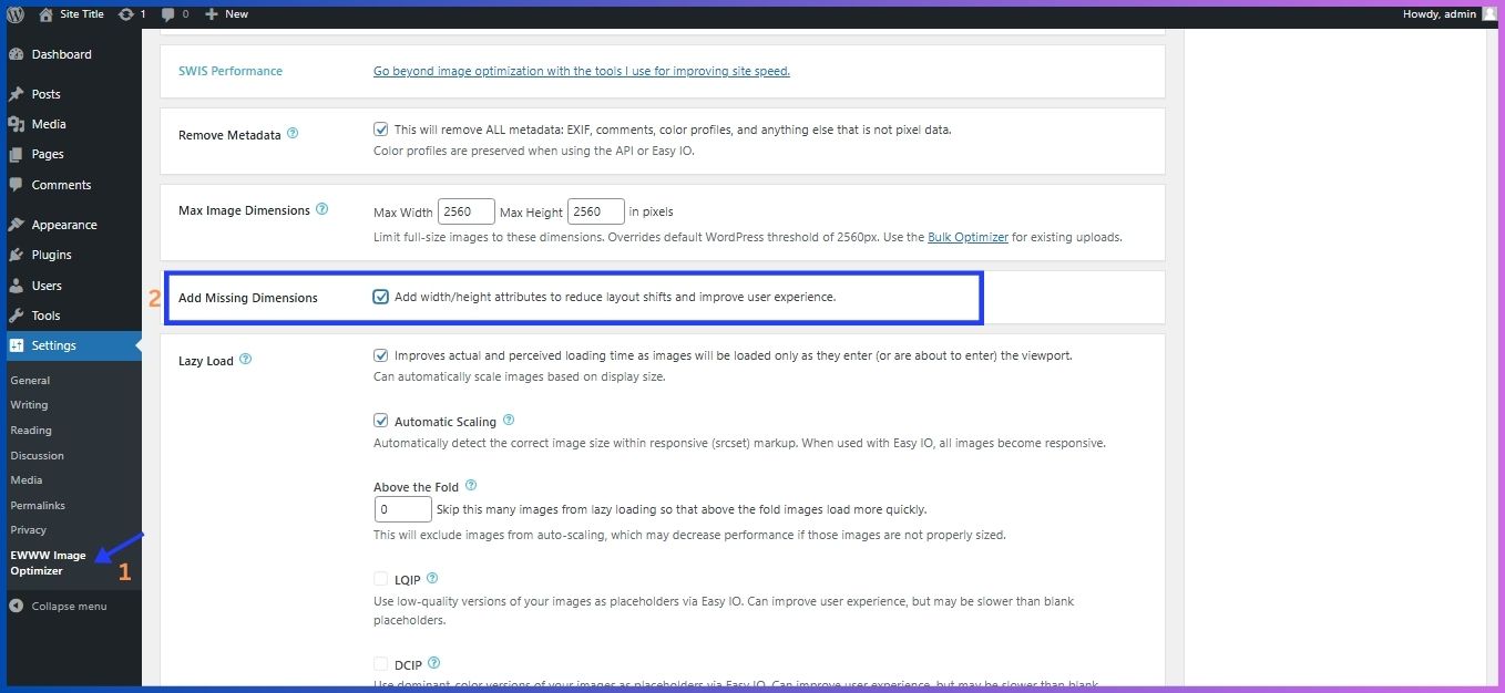
EWWW Image Optimizer
Go to setting> EWWW Image Optimizer. Under Essential, scroll down to “Add Missing Dimensions” and enable it, this will add width/height attributes hence reducing layout shifts and improve user experience. You can also set the “Max Image Dimensions” however, I recommend leaving the default setting.
LiteSpeed Cache
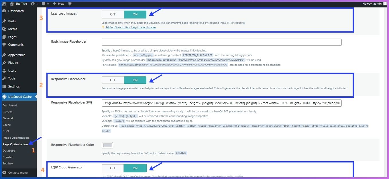
On the left side bar under “LiteSpeed Cache”, choose the “page optimization” option > Media settings. Scroll down to “Add Missing Sizes” and set it on. This helps to set an explicit width and height on the image elements hence reducing layout shifts and improve CLS. Afterward, click on the “save changes” button to update changes.
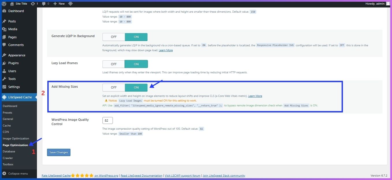
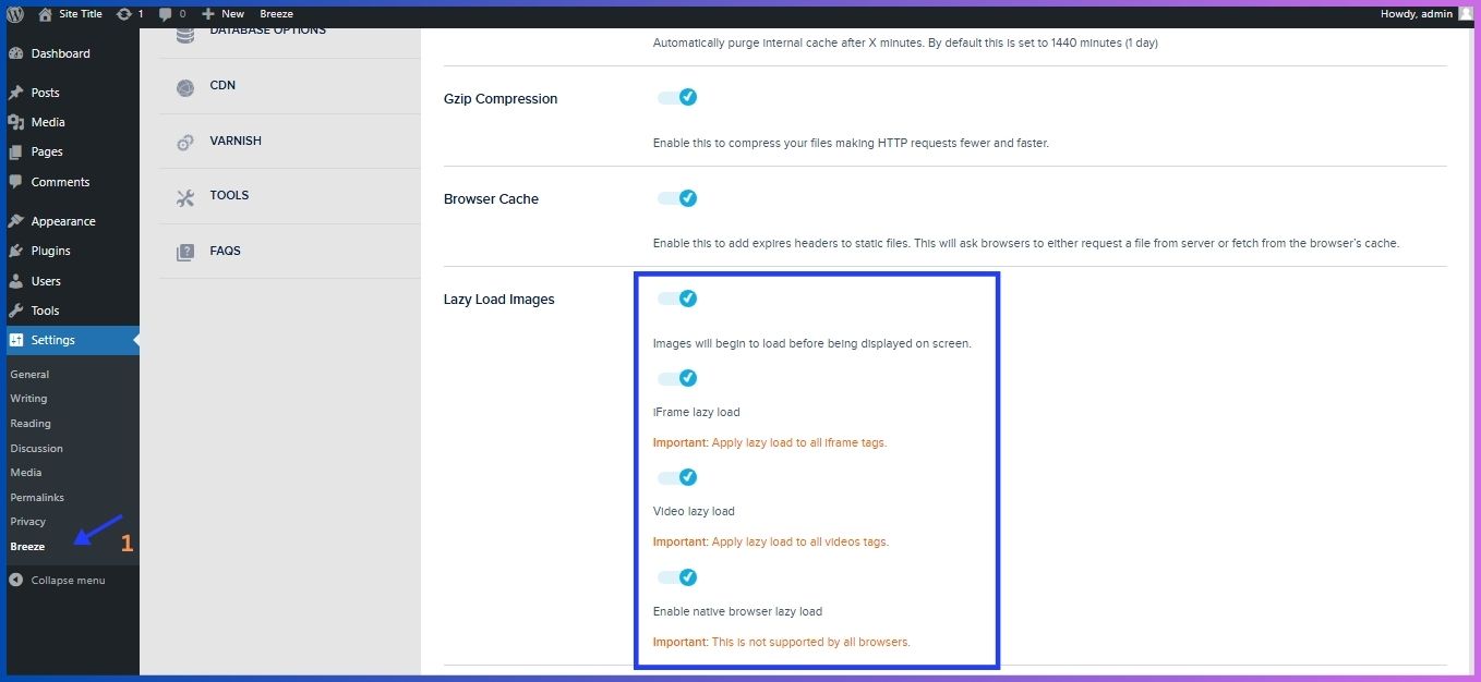
Meanwhile, you can also scroll up and enable “Responsive Placeholder” option (helps to reduce layout reshuffle when images are loaded. This will generate the placeholder with same dimensions as the image if it has the width and height attributes.), also enable “LQIP Cloud Generator”, “Lazy Load Images” and “Lazy Load Iframes” (Load iframes only when they enter the viewport. This can improve page loading time by reducing initial HTTP requests.)
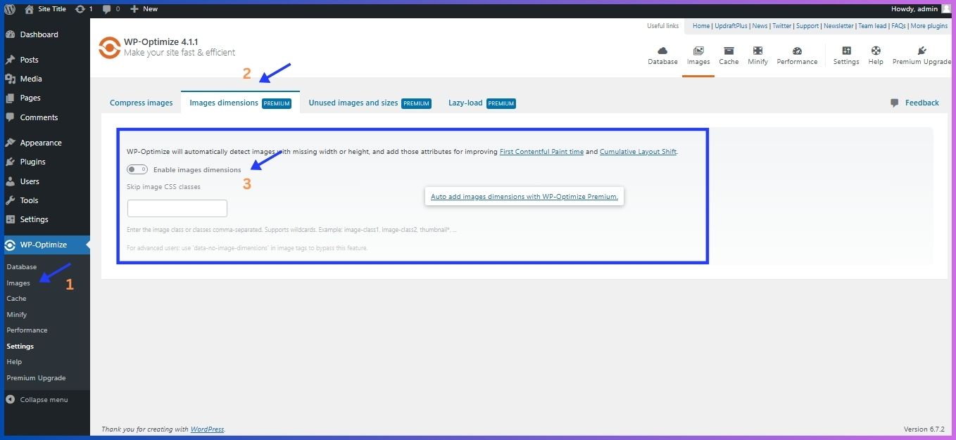
WP-Optimize
Go to ‘WP-Optimize’ on the left admin side bar > Images > Image Dimensions. Click on the “Enable Image Dimensions” button to turn it on. Note that this is a premium feature.
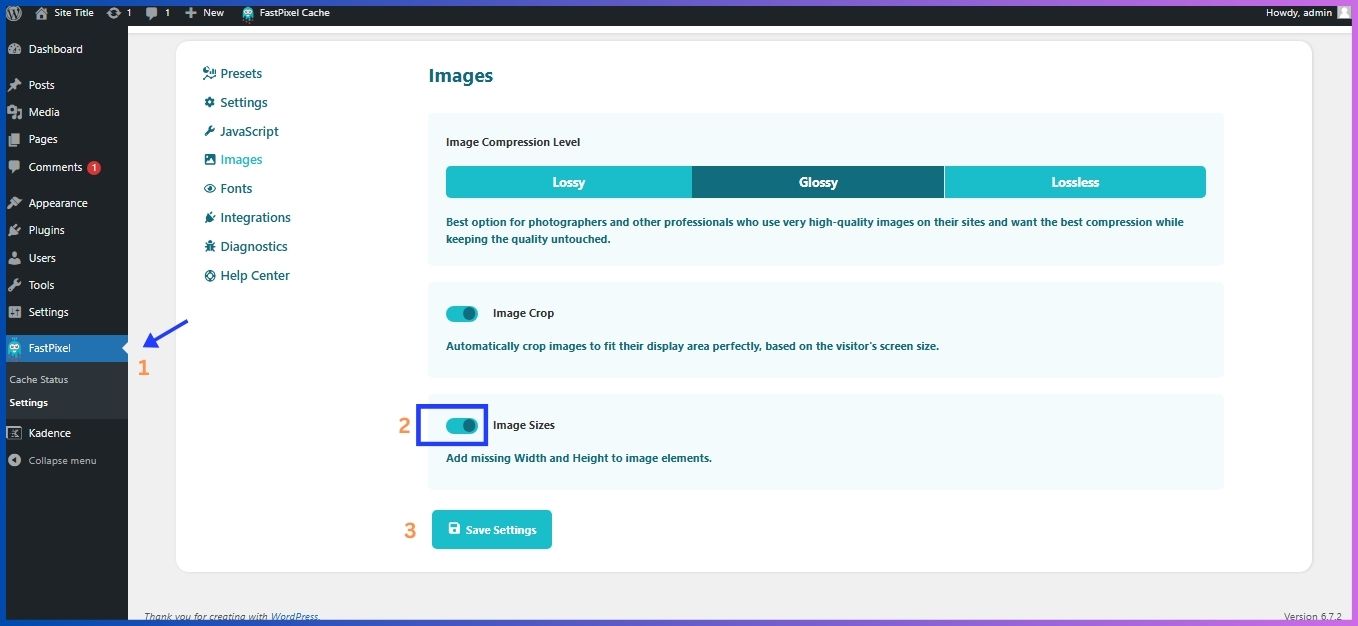
FastPixel Cache
Install FastPixel Cache and activate it. On the left sidebar admin menu, click on FastPixel > Images. Make sure to enable the “Image Sizes” button which will enable you to add missing Width and Height to your image elements. Don’t forget to save the changes.
Using block settings to set the height and width
To modify your image size, click on it, then > “Block Settings” panel on the right sidebar > ‘Settings’ section.
After selecting the image you are working on, you will see an option to manually enter the exact pixel dimensions in the ‘Width’ and ‘Height’ fields. There is also an additional option to adjust the size in percentages. Afterward, update the changes by clicking the Update button.
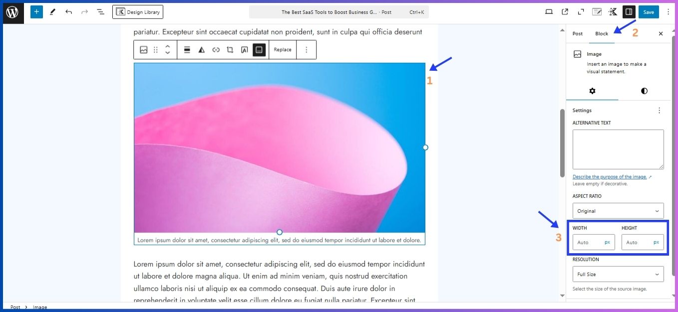
I’ve found that choosing “Auto” for the percentage setting works wonders for most situations. This dynamic adjustment ensures that the image in question, scales proportionally to fit the container (in this case your device’s screen), making it responsive on desktops, tablets, and mobile devices.
While the pixel perfect dimensions could seem like the way to go, they can actually backfire on different devices. An image that looks perfect on your laptop might appear tiny on a high-resolution tablet or enormous on a smaller screen. The “Auto” setting lets WordPress do the heavy lifting of making these adjustments for you.
Beyond Just Dimensions: Image Optimization Tips
Setting explicit width and height is important, here are a few more tips I’ve learned the hard way:
- Use appropriately sized images: Don’t use a 1700px wide image for a 650px container. Utilize the srcset attribute for serving different image sizes based on the user’s device. However, a plugin like EWWW does that automatically.
- Implement lazy loading: Add the loading=”lazy” attribute for images below the fold. The images will load as users scroll, hence improving performance.
- Compress your images before uploading – there are tons of free tools that can reduce file size without noticeable quality loss
- Serve next-gen formats: Consider using modern formats like WebP which offer better compression than traditional JPGs and PNGs.
- Include meaningful alt text: This improves accessibility and SEO.
- Consider image CDNs: Services like Cloudinary, Cloudflare, or Imgix automatically optimize images and can add dimensions
Related: AI-Driven Cloud Optimization
Image Dimensions and Responsive Design
You might wonder how fixed dimensions work with responsive designs. The key is understanding how modern browsers interpret width and height attributes:
img {
max-width: 100%;
height: auto;
}
With this CSS, browsers will maintain the aspect ratio based on the specified dimensions while allowing the image to resize according to its container.
Common Mistakes to Avoid
When implementing image dimensions, watch out for these common pitfalls:
- Incorrect aspect ratios: Setting dimensions that don’t match the image’s actual ratio causes distortion
- Forgetting to update dimensions after image edits: Always update HTML attributes when replacing images
- Neglecting responsive images: Even responsive image sets need dimensions
- Ignoring background images: While not using <img> tags, CSS background images also benefit from defined spaces
Test and Validate
After making changes, ensure everything is working as expected:
- Browser Testing: Check your pages on different browsers and devices.
- Performance Tools: Re-run audits with Google Lighthouse to confirm improvements in CLS and overall performance.
Conclusion
Fixing the “Image Elements Do Not Have Explicit Width and Height” issue is an effective way to enhance your site’s performance and user experience. You create a smoother browsing experience when prevent layout shifts, while at the same time improving your search rankings.
Take the time to audit your site for missing image dimensions and implement the fixes outlined above. Your visitors (and search engine rankings) will thank you for it.
Remember, in web development, sometimes the smallest details make the biggest difference. Explicit image dimensions might seem like a minor technical point, but they significantly impact how users experience your site.
Disclosure: We may earn commission for purchases that are made by visitors on this site at no additional cost on your end. All information is for educational purposes and is not intended for financial advice. Read our affiliate disclosure.


